
finished basic layout
I’ve finished the basic layout of the blog and it is now ready for accepting posts. I initially set several goals for it:
- Cheap/Free hosting
- https
- Cyberpunk vibe
- Scale across devices
- Fast loading
Each of these had some challenges which I’ll get into in the following sections.
free hosting
I did not want to spend money on this blog.
Additionally I wanted to host nothing but static pages, but if possible I wanted to use some sort of engine to generate those pages.
And I would be publishing all my code.
Luckily the days of horrible advertisement filled free hosting are behind us.
Since I wanted the blog to be opensource, naturally I planned to host the code on github. And thanks to github pages this meant I couldn’t only host my code on github, github would display it for me too, all for free!
Github pages has support for jekyll by default. Since my blog consists only of static pages, this was perfect. With this not only do I get to host my static pages on the github servers, github will actually do the building of it for me too (though usually I also build locally for testing). There are some limitations to this, there are only a few jekyll plugins you can use since github doesn’t want you running untrusted code on their servers, which is totally understandable.
If these limitations become a problem, I can switch to building the site locally and just deploying on github.
All I had to do to use it was create a repo called username.github.io, create a new jekyll project in it and follow the instructions to configure jekyll.
https
Github pages do support https. However that is only if you use the provided github.io address (or maybe if you use a standard www subdomain?).
For me that wasn’t good enough, the name of the blog is secur.ity-pro.be not www.ity-pro.be.
Luckily it was easy to fix: instead of pointing my domain to the github.io server, I pointed it towards cloudflare. Cloudflare would then create a valid certificate, forward the request to wknd.github.io and cache the response.
Now I have a valid https certificate, with only a free cloudflare account. And because I now also use the cloudflare nameservers, I can easily generate more certificates for the other subdomains I use without having to expose them to the internet.
look and feel
Since the blog is meant for technical projects and writeups I wanted to go with a nice clear cyberpunk vibe.
What makes a layout clearly a cyberpunk layout? Some even argue that you can’t make a cyberpunk website at all without all sorts of VR support, but I think thats going a bit too far. Even in any imaginary cyberpunk world there will need to be simple text displaying devices, and what is better for that than just a flat screen with some text?
But then what makes the site layout cyberpunk and not just another dark or neon theme. I tried finding examples of existing cyberpunk themed websites and came up short. The best (and only clearly cyberpunk) design I found was on neondystopia.
It made me conclude that the defining factor is to not just use some dark theme with some flashy highlights, but to incorporate images into the website that are cyberpunk themed themselves. So my first decision was to make sure my layout played nice with images, and force myself to use an image for every single post.
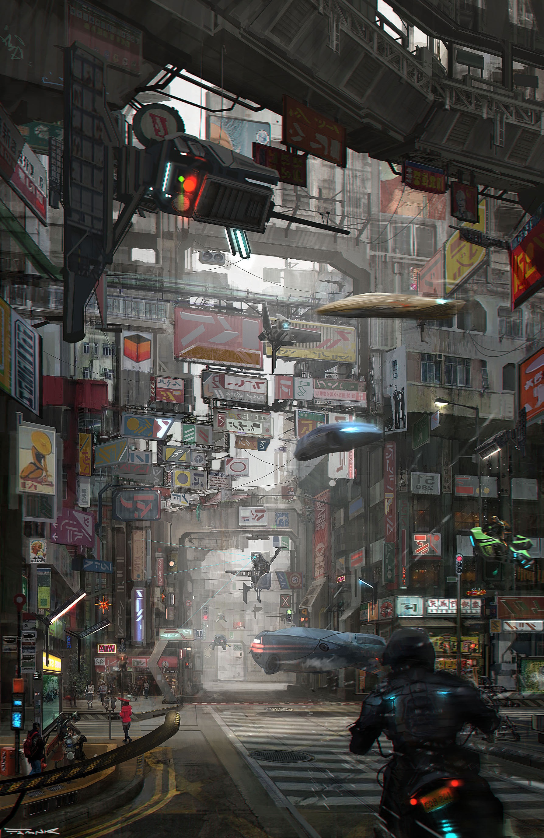
Image license: artists permission
images
As a background image I ended up going with “cross-street” by Francesco Lorenzetti. I think its a wonderful image and it’s almost a shame it’ll be mostly hidden by the content. Not to mention that most of it won’t be visible if you aren’t using a screen in portrait mode.
The images that accompany each post need to be wide to scale properly on the index page. So as a rule I’ll only use pictures in landscape mode for those.
colours
Second I needed to decide on the colours I’d use. I’m definitely no graphic designer, my last few personal sites were made out of ascii art. As inspiration I thought I’d look at the color-schemes used for syntax highlighting.
Most of those are picked to provide enough contrast between the colours and usually come in a light and a dark variant. I picked the base 16 summerfruit theme as my starting point.
In the end I only used 1 of the bright colours for extra flash while using its foreground and background colours for everything else.
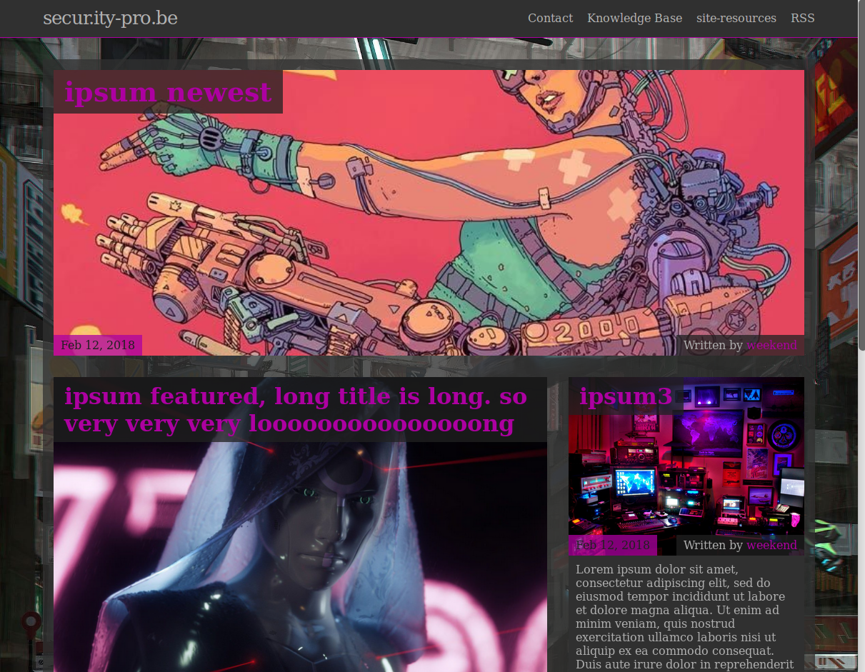
For the actual layout I took some more inspiration from neondystopia. I really liked the idea of having a grid layout, with the newest post being extra large, and a large featured post.
responsive design

by weekend
by weekend
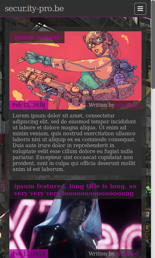
Since css grid is now available for all major browsers, I decided to use it, which made the whole process pretty easy. Combined with media queries the amount of code required to have everything in the correct place is very minimal. I start off with a layout designed for small screens, and then work my way up to tablet size, and then laptop size.
The phone layout is 1 column wide, the tablet layout is 2 columns wide and in desktop mode it is 3 columns wide.
by weekend
Jekyll supports sass/scss out of the box and the default jekyll theme (minima) that I loosely used as a base is built using scss. So naturally I decided to use it as well.
I’ve never written a lot of css beyond what I’ve been forced to use to get something done, so I can’t speak to how much easier it is than plain css. But so far its made writing all these styles a pleasant experience.
To make the main page scale nicely we have a .post-list class containing all the posts, and each post belongs to the .post-entry class.
The .post-list is 1, 2 or 3fr wide depending on the screen size. And then all that was needed was to give the newest and featured post a fixed position in the grid.
.post-list {
  list-style: none;
  display: grid;

  grid-template-columns: 1fr;
  grid-gap: ($spacing-unit / 2) ($spacing-unit / 2);
  @include on-tablet {
    grid-template-columns: 1fr 1fr;
    grid-gap: $spacing-unit $spacing-unit;
  }
  @include on-laptop {
    grid-template-columns: 1fr 1fr 1fr;
    grid-gap: $spacing-unit $spacing-unit;
  }
  grid-auto-flow: row;
  justify-items: stretch;
  justify-content: stretch;
}
.post-newest {
  grid-column: 1 / -1;
  grid-row: 1 / 2;
  ...
}
.post-featured {
  grid-column: 1 / -2;
  grid-row: 2 / 3;
  ...
}
To easily create projects in different repositories, all the global stuff is housed in its own repository. You can checkout all the css here.
fast loading
by weekend
by weekend
No one wants to wait a long time for a page to load. People need adblockers and other add-ons to filter out the crud on an average page just to make browsing bearable.
I don’t want to wait for my own site to load so I decided to make it go as fast as I can possibly make it.
First off, the blog contains only static content, so all pages are pre-rendered. Jekyll handles all that for me.
Second, no huge js or css libraries allowed. If I need anything fancy I’ll write it myself at the risk of being less compatible with older browsers. I might eventually add some sort of tracker, but only if its not too privacy invading and not too bloated.
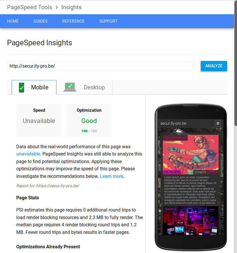
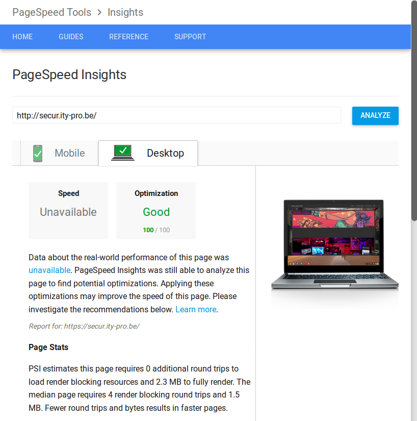
Third, I want 100% on google pagespeed
late loading css
So far, the first 2 goals are met. With the 3rd one being met for the index page.
I made sure to split all the css into parts that are vital and parts that are extra.
Since the title of this post is “finished basic layout”, all css except for syntax highlighting is essential. The rest will come later.
I put my vital css inline instead of in an external style sheet. This means the browser doesn’t have to do another roundtrip to fetch it, and thus it doesn’t have to wait until finishing that connection in order to display the contents of the page. The css that adds extra functionality (for instance syntax highlighting, or fancy borders and shadows in the future) is loaded in with a normal external stylesheet. To get 100% on all pages I need to make sure that this full css file gets loaded AFTER the page is fully loaded. This is on the todo list.
images
An additional requirement to get 100% on the pagespeed test, was minimizing my images. Images take up the largest amount of data on each page, especially on such an image focused website like this blog.
I’m using the standard image magick tools that came in Ubuntu 16.04 (convert, mogrify) to minimize my images. I make sure to also keep the original image, and always link back to that one. But all images that are displayed directly on a page are the minimized versions. To find proper settings that seem most optimal for most images I followed the advice of Dave Newton.
Using his parameters I wrote a little shell script that’ll go through all my images and minimize the ones that haven’t been done yet. I just need to remember to run this whenever I add a new image.
caching
by weekend
Another requirement for google pagespeed to give a good score is properly utilizing caching. Loading an image or css for the first time can take seconds, but loading it a second time should take no time at all!
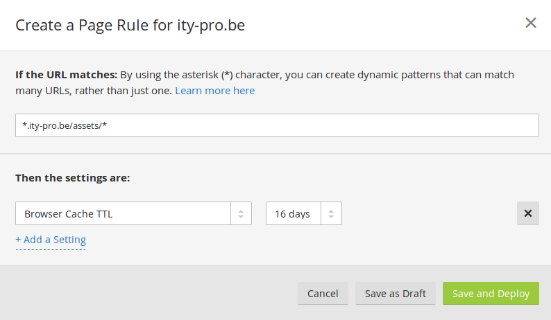
However I have no control over the webserver to set the proper caching headers.
Luckily I put cloudflare infront of the github server.
Using a CDN like this has the extra benefit that you are likely to get pages from their cache which is geographically closer to you than the actual server hosting the content is. But most importantly, it allows me to specifically set for how long certain resources are valid.
We have 3 pagerules we can set on the cloudflare free tier, to enable caching we need to create a rule that sets the browser cache ttl to 16 days on all our assets (which has images, css and js). I found that much less than that was not long enough to get a good score.
Currently this rules is set for all resources that match *ity-pro.be/assets/*, but in the future I might make that rule even more generic so it can also match assets that are in subdirectories. This would allow me to create projects in different github repositories.
All in all I think this is a good first rendition of this blog, and enough for me to start actually using it.
Future updates on my todo list include but aren’t limited to:
- late load non vital css
- add more depth to the design
- create more projects on github that are integrated into this site
- add metadata to images, and store that efficiently
- add support for single posts to have multiple authors
- support pagination on the index